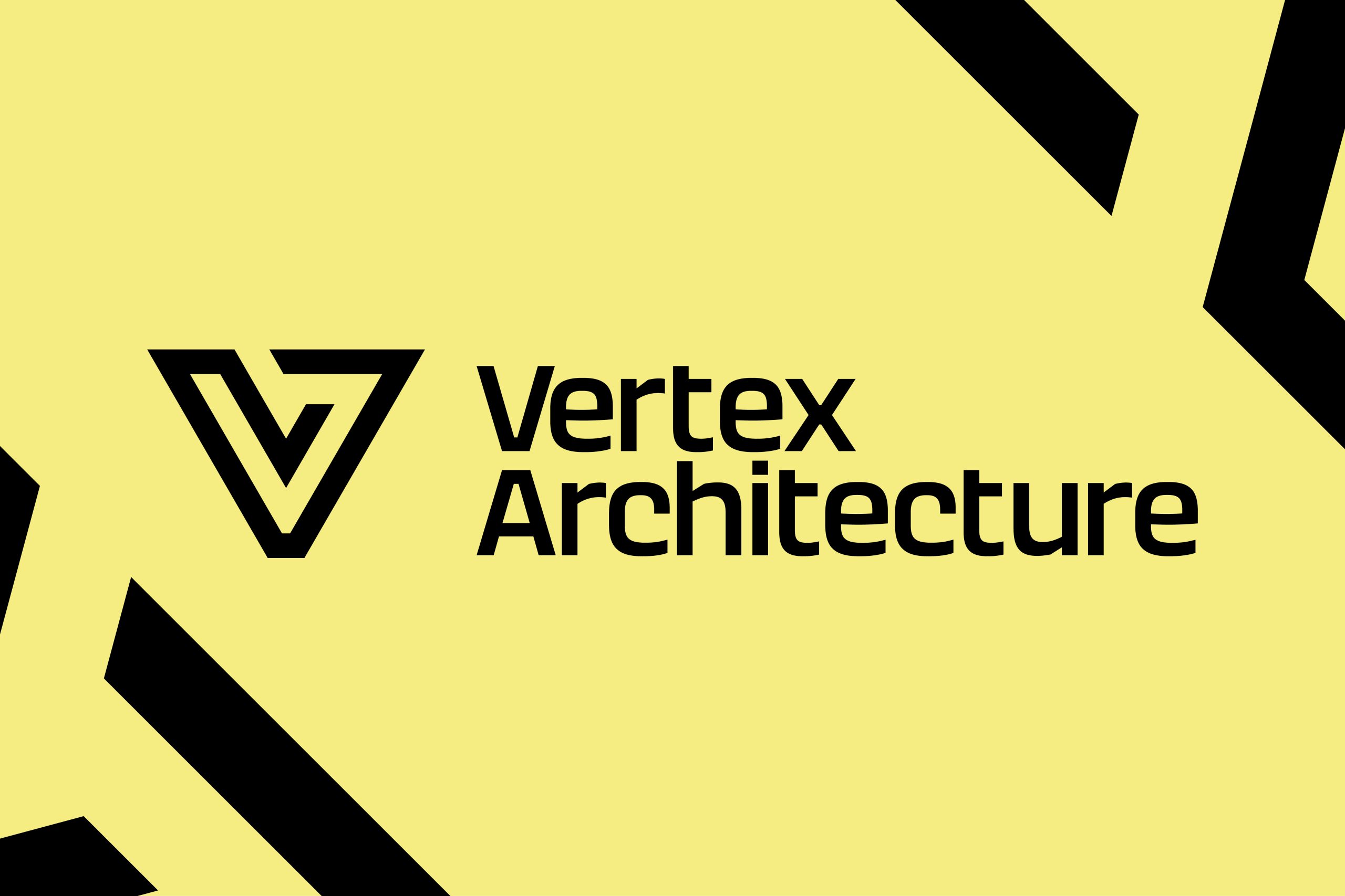
Architecture is an investment, which is why we have decided to bring you a bold new look with the same personal feel. We have stripped back our identity to its core elements to refresh our icon, pairing it with a new typeface that will create more impact in the architectural industry.
As a company we decided we wanted to find a look that better reflects us, our values, and the quality of our projects. Something bold, eye-catching, and refreshing. The high contrast darker colour palette was chosen to better emphasise our brand. A very striking shade, using black draws its own attention, especially when paired with a vibrant colour such as yellow. This helps to showcase our projects and makes them even more memorable.
We will be finalising details and rolling out new things over the up-and-coming months so keep your eyes peeled for our new branding out and about.
